
Blog
Sales Page for Your Online Course: How to Make It Convert
A section-by-section breakdown of a high-converting sales page for your online course: headline, problem, solution, proof, offer and the CTA.
Getting membersYou can build a brilliant online course, but if your sales page does not convince people, nobody enrolls. The sales page is where interest turns into a decision, the single moment that determines whether a visitor becomes a student or clicks away. A high-converting sales page for your online course removes doubt, answers every question and leads the reader clearly toward enrolling.
This guide breaks down every section of a sales page that converts, in the order it should appear, with the thinking behind each part. Follow it like a template and you will have a structure that does the selling for you.
The short answer: headline with a specific outcome, the problem in your reader's words, the transformation before the module list, proof next to every claim, a price with the risk removed, and the same button repeated down the page. In that order.
Why your sales page for an online course is your most important asset
Most marketing has one job: to get someone onto your sales page. Your content, your ads, your emails and your social posts all point here. That makes the sales page the place where all your effort either pays off or leaks away. A small improvement to a page that everyone sees can be worth more than months of chasing new traffic.
The page also has a single, focused purpose, unlike almost any other page you own. It is not there to inform or entertain. It is there to turn a visitor into a buyer. Every word, image and button should serve that one goal, which is exactly why a sales page for an online course deserves more care than nearly anything else you create.
The whole page in one table
| Section | The question it answers | The usual mistake |
|---|---|---|
| Headline | What will I be able to do? | naming the topic instead of the result |
| Problem | Do they understand my situation? | writing it in your language, not theirs |
| Solution | How does this get me there? | listing modules before the transformation |
| Proof | Has it worked for someone like me? | vague praise without a name or a number |
| Offer | What does it cost and what if it fails? | hiding the price until the checkout |
| Call to action | What exactly happens when I click? | one button at the very bottom |
Six sections, in this order. Everything below is the detail for each one.
Why one percentage point is worth more than more traffic
Suppose 500 people visit your page each month and the course costs €497. At a 1 percent conversion rate that is five sales, or €2,485. At 2 percent it is €4,970. Doubling the rate earns the same as doubling the traffic, and it is usually the cheaper of the two to achieve, because the page is something you control completely. The numbers are an illustration, but the ratio holds at any size.
Think of the page as a conversation with one ideal student. It anticipates their questions, addresses their doubts and walks them from problem to solution to decision. When you write it that way, the structure below almost falls into place on its own.
The headline: promise a specific outcome
The headline is the most important line on the entire page, because it decides whether anyone reads on. A strong headline names a specific outcome, not a topic. Not a course about productivity, but reclaim ten hours a week in the next 30 days. The more concrete and believable the promise, the harder it is to scroll past.
Three ingredients make a headline work: a clear result, ideally a timeframe, and the audience it is for. Avoid clever wordplay and jargon that make people think. A subheadline beneath it can add the how or remove the first objection. Test different versions, because a better headline can lift conversions without changing anything else on the page.
| Weak headline | Why it fails | Rewritten |
|---|---|---|
| A course about productivity | names a topic, promises nothing | Reclaim ten hours a week within 30 days |
| Learn Excel properly at last | no audience, no result | Build the reports your boss asks for, without formulas you have to look up |
| The ultimate yoga program | superlative instead of substance | Touch your toes again in eight weeks, 20 minutes a day |
Result, timeframe, audience. If a headline has all three, it rarely needs cleverness.
Keep the headline above the fold, the first thing a visitor sees without scrolling. If they grasp the promise in a few seconds, they keep reading; if they have to hunt for it, they leave before your page gets a chance.
The problem section: speak to the pain
Before people care about your solution, they need to feel that you understand their problem. The problem section shows that you get it. Describe their situation so accurately that they think this person is talking about me. When readers feel understood, they trust that your solution was built for them specifically.
Be specific and use their language, not yours. Name the frustrations, the failed attempts and the cost of staying stuck, whether that is wasted time, lost money or quiet self-doubt. Do not exaggerate or manipulate. The goal is honest recognition, the feeling of being seen, which opens the door to the solution you are about to offer.
Your solution and what the course includes
Now that the problem is clear, present your course as the bridge to a better situation. Lead with the transformation, not the features. People do not buy lessons, they buy the result those lessons produce. Paint the after picture first, then show how the course gets them there.
Once the vision is clear, lay out what is inside: the modules, the format, the time required and what they walk away able to do. A simple outline builds confidence in the scope without overwhelming. Mention any bonuses, support or community access here too, since these often tip an undecided reader over the edge. You can build and host all of it as shown on the courses page. If the course itself is not built yet, how to create an online course comes first, because a sales page can only promise what the course delivers.
Social proof: testimonials and results
People trust other people far more than they trust your claims. Social proof is one of the strongest levers on any sales page for an online course, because it shows your method has worked for real people. It quietly answers the question lurking in every reader's mind: but will it work for me?
The most persuasive proof is specific. A testimonial with a name, a photo and a measurable result beats vague praise every time. Add numbers where you have them: how many students, what completion rate, what outcomes. If you are just starting out, gather testimonials early through a discounted first cohort, because nothing sells like a real result from a real person.
Place proof throughout the page, not just in one block, so a relevant testimonial sits next to each claim it supports. Different formats help too: written quotes, short video clips, screenshots of real messages and recognizable logos all build credibility in their own way.
Where proof crosses into a legal problem
If you sell into the United States, the FTC's endorsement guides apply, and they are stricter than most creators assume. A testimonial showing an unusual result must make clear what results people can generally expect, and adding a line like "results not typical" or "individual results may vary" does not fix a misleading impression. Any material connection between you and the person endorsing you, payment, a free seat, a family tie, has to be disclosed clearly and conspicuously (FTC endorsement guides, checked on 14 August 2026). The practical version: use real results, say how common they are, and disclose anything you gave the person.
The offer, pricing and guarantee
This is where you make everything concrete. Present the price clearly and without apology, framed against the value and the transformation rather than in isolation. Anchoring helps: show what the result is worth, or what the alternative costs, so the price feels reasonable in context.
Reduce the risk as much as you can. A money-back guarantee tells people you stand behind your course and shifts the risk from them to you, which removes one of the biggest reasons people hesitate. If you offer payment plans, show them here, since a smaller monthly figure can make a yes far easier. Honest urgency, like a real deadline or a closing bonus, gives a reason to act now rather than later.
Payment plans change the number, not the price
A payment plan makes the decision smaller without lowering what you earn. A course at €497 paid once, or three payments of €179, is €537 in total, which covers the extra processing fees and the risk of a plan that stops halfway. State both options side by side and let the reader choose. Where to set the base price in the first place is covered in how to price an online course, and discounts have their own rules in coupon strategy.
Be transparent about exactly what happens after purchase, including how and when access is delivered. Clarity at the point of payment removes the last flicker of doubt that can quietly stop a sale.
The CTA: close without pressure
The call to action is the moment of decision, so make it effortless. Use a button text that describes the action or the benefit, like enroll now or start the course, not a flat submit. Repeat the same button several times down the page, so the decision is available wherever a reader becomes convinced.
Closing without pressure means making the next step feel safe and obvious rather than pushy. Restate the core promise near the button, remind them of the guarantee, and remove every distraction that could pull them away. A sales page should have one goal and one path, so strip out menus, outbound links and anything else that competes with the enroll button.
Speed is part of the conversion
A page nobody waits for cannot convert. Google's threshold for Largest Contentful Paint, the moment the main content appears, is 2.5 seconds or less for a good experience (web.dev on LCP). On a sales page the usual culprits are an uncompressed hero image and an autoplaying video above the fold. Compress the hero, load video below the fold, and check the page on a phone on mobile data rather than on your desktop.
Publish your course checkout page on memberarea.io
A persuasive sales page is only half the job. The move into the purchase has to be just as smooth, or you lose people at the final step. On memberarea.io every offer gets a product page and a branded checkout, with no jarring jump between the promise and the payment. The reader clicks your button and lands in a checkout that matches your page, then gets instant access to the course.
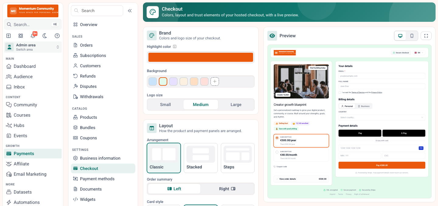
The jump from page to checkout is where trust is most often lost. Matching both is the cheapest fix on this list.
Because the product page, checkout and course live together, a click becomes a student without friction. You can add coupons, payment plans and order bumps directly, a mechanic explained in upselling an online course, and see in your orders who bought and who abandoned the checkout. The emails that carry people to this page are covered in email marketing for online courses. See the checkout on the checkout page and the plans on the pricing page.
Publish your course checkout page on memberarea.io and turn convinced readers into paying students without a single broken step. Try memberarea.io for free and bring checkout and course together in one place.
Frequently asked questions
How long should a sales page be? As long as it needs to be to remove every objection. Low-priced courses often sell from a short page, while higher-priced ones need more proof, detail and trust. Length follows price and complexity, not a fixed rule.
Do I need a video on my sales page? It often helps but is not required. A short video where you explain the benefit and build a human connection can lift conversions, yet a clear, well-written page sells perfectly well on its own.
How do I improve a sales page that is not converting? Start at the top with the headline and first promise, then the social proof and the CTA. Change one thing at a time so you can see what actually moved the needle.
Conclusion
A sales page for an online course is not decoration, it is the lever that decides between a sale and no sale. Lead with a specific promise, show readers you understand their problem, present your course as the bridge to a better outcome, back it with real proof, make the offer and guarantee clear, and close with a confident, pressure-free call to action.
Start with a simple, clear page and improve it using your numbers over time. Try memberarea.io for free and connect your sales page to checkout and course in one place.



Ready to build your membership?
Try it free for 14 days. No credit card, no setup fees. Launch in minutes.
No credit card required · Cancel anytime